Eat Clean
Eat Clean

My goal was to design a guided tool to help communities ensure all residents have access to healthy food and alternatives to their intolerances. “Eat Clean” is offered both as a dedicated mobile app and responsive website.
February 2023 - March 2023
UX Design
Project overview
Problem:
A lot of people have food intolerances and do not have access to healthier options whether it is when shopping at the supermarket or when eating out in cities. This can be frustrating especially when looking for products that are safe to eat can take a lot of time.
Goal:
The goal of the app and website is to help individuals in communities identify allergens in the products they pick up at the supermarket, search for suitable alternatives, find restaurants in their neighborhood with intolerance-friendly meals and find relevant resources for recipes and guides.
My role:
Design process from beginning to end—user research, wireframing, prototyping, usability studies, etc.
User research
Research:
I conducted interviews and created empathy maps to understand the users I am designing for and their needs. A primary user group identified through research was individuals who need to find intolerance-friendly products and meals whether it be from home or on the go.
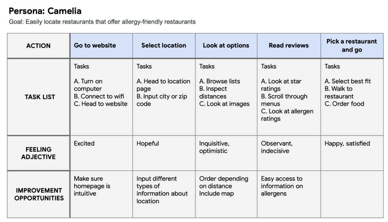
Persona 1:
Problem statement: Camelia is a traveling freelance designer who needs a solution that provides easy access to healthy, natural, and allergen-free meal options while traveling because she has several food intolerances and wants maintain her diet.


Persona 2:
Problem statement: Robert is a busy single father who needs a tool to easily and efficiently identify allergens in food products while shopping at the supermarket because he wants to take products that are safe for his daughter who has multiple food allergies, including nuts, dairy, and yeast.


Competitive audit
There are multiple other options in the market, but there does not exist a free all-inclusive tool that is visually pleasing and intuitive.

Digital Wireframes
I included images of products so there is a visual element and a search bar so that users could search specific items based on their needs.


User research, however, revealed there should be not only icons but also words on the navigation bar on the bottom of the screen for better accessibility.

Low-fidelity Prototype
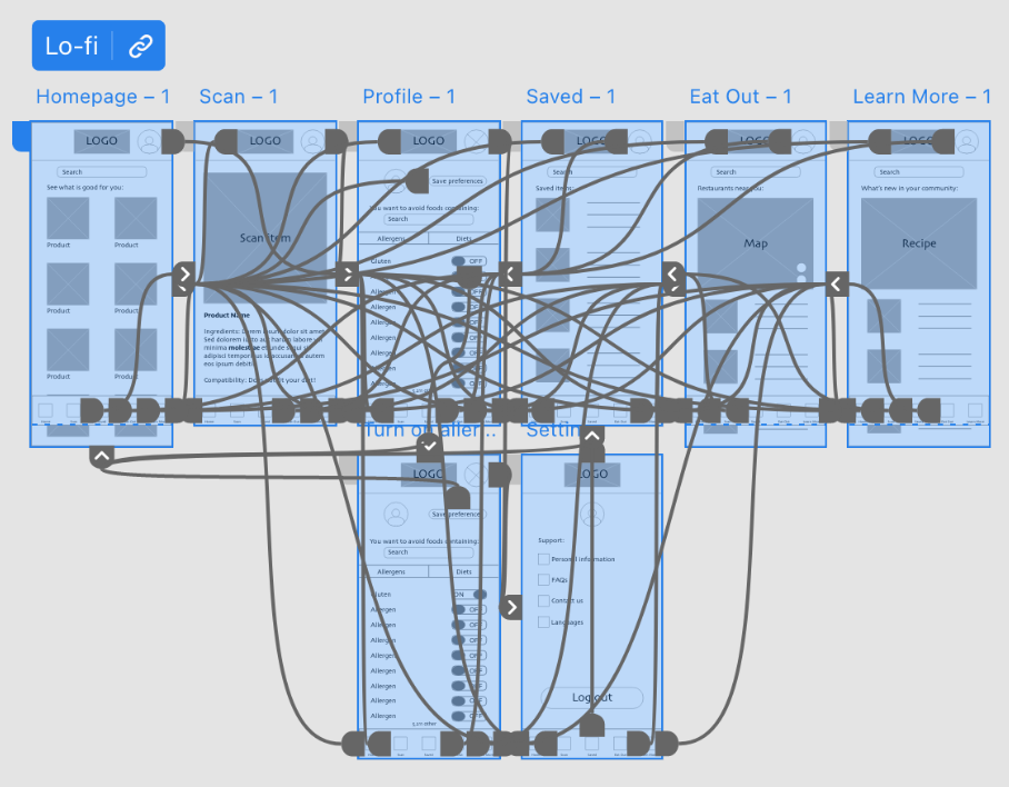
After different iterations of the digital wireframes, I created a low-fidelity prototype for the dedicated mobile app.

Usability Study

Findings:
Confusion: Some users were confused about how to indicate intolerances because there was no text prompt on the profile page
Visual: Some users thought the scan taking up the whole page is redundant, and, rather, the scanner should be smaller to allow for product details on the bottom of the screen
Language: Users thought it would be helpful to be able to change languages on the app to be more inclusive
Mockups
I added a line that says “Avoid foods containing” and guides the user to select ingredients, diets or allergies he/she has. I also made the camera scan smaller to allow for product details on the bottom with ingredient details, ability to save product for easy access, and a badge for whether it is safe to eat based on your personal preferences.


High-fidelity Prototype
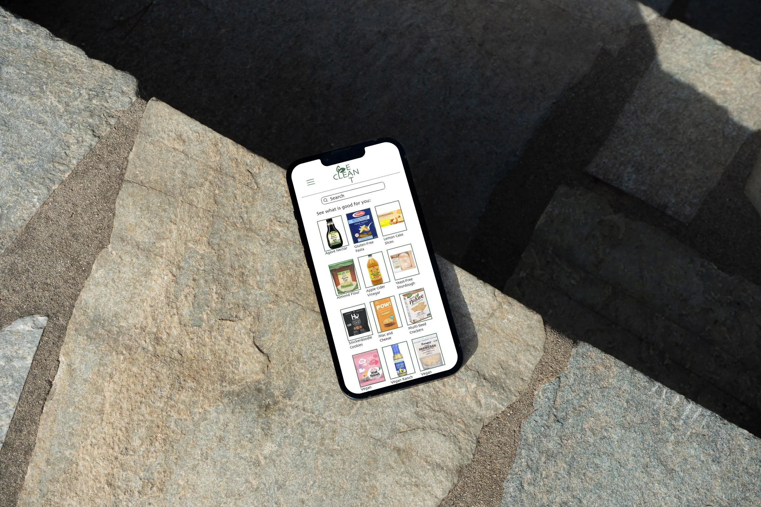
After multiple considerations, refining rounds and usability studies, I finally created the high-fidelity prototype for the dedicated mobile app “Eat Clean.”

Accessibility Considerations
Made use of iconography to make navigation easy and intuitive to all
Used detailed imagery of all products, recipes and restaurants to help all users better understand and visualize the options at hand
Included language feature in the menu that allows for people of different backgrounds
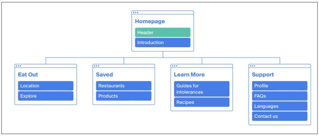
Responsive Website Sitemap
This is the sitemap for my website. I hesitated about whether to have an independent homepage or simply an explore page with suggested products.

Mockups
I created a dedicated mobile app, and a responsive website for a desktop and a tablet. For the tablet, I wanted to have a hamburger menu on the top rather than a bottom navigation bar. These are some of the screens for the mobile app, desktop website, and website on a tablet.


Takeaways
As this was my first design project from start to end for both a mobile app and responsive website, I enjoyed building upon the designs I created and refining them for various screen sizes. I transferred everything I learned in the UX process and applied it to both a dedicated mobile app and responsive website. I love the final product and I think it’s a design that I would love to use in my everyday life.
User quote: “The website is really helpful! I could definitely see myself using this in multiple contexts.”
Next steps
Conduct another round of usability studies to validate whether the pain points users experienced have been effectively addressed
Conduct further user research to determine any new areas of need
Refine high-fidelity prototype by adding pages for menu items and more complete ingredient list, adding options and interactions