Portfolio Project #1
Portfolio Project #1

The product is an ingredient inventory app for a hypothetical cafe named Tess’ Cafe. It aims to help cafe owners manage their inventory.
January 2023 - February 2023
Project overview
Problem:
A lot of cafe owners have big inventories and might struggle managing them efficiently, with no clear image of inventory levels and usage. This can lead to incomplete orders and waste.
Goal:
The goal of the app is for to help cafe owners manage their ingredient inventories more efficiently, keep track of levels so that they can avoid shortages and surpluses, and to guarantee customer satisfaction.
My role:
Design process from beginning to end—user research, wireframing, prototyping, usability studies, etc.
User research
Research:
I conducted interviews and created empathy maps to understand the users I am designing for and their needs. A primary user group identified through research was cafe managers who have difficulty keeping track of inventory levels.
A lot of cafe managers have big inventories and might struggle managing them inefficiently, with no clear image of inventory levels.
Pain Points:
1- Keeping Track: Cafe staff cannot properly keep track of what ingredients are available and not
2- Management: Cafe managers might not have an efficient management strategy, which can lead to a lot of confusion
3- Visibility: They might also struggle to visualise inventory levels and usage, preventing them from making decisions
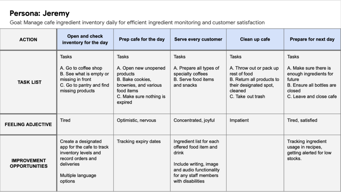
Persona:
Problem statement: Jeremy is a busy cafe owner who needs a faster, more efficient way to manage his cafe’s ingredient inventory because currently, it is prone to confusion, waste, and leaves some customers dissatisfied.

Mapping Jeremy’s journey revealed how helpful it would be for cafe staff to have access to a dedicated ingredient inventory app.
Paper Wireframes
Taking the time to draft iterations of each screen of the app on paper ensured that the elements that made it to digital wireframes would be well-suited to address user pain points. I worked on 5 iterations of the same page to then refine it into one final paper wireframe.


Digital Wireframes
As the initial design phase continued, I made sure to base screen designs on feedback and findings from the user research.

Features:
Category names so that each ingredient is easy to find
Image of each ingredient so that it is easy to see

Features:
Related products section to see details of other ingredients
Remove, add and cancel buttons to easily manage ingredient levels
Low-fidelity Prototype
This low-fidelity prototype connected the primary user flow of viewing ingredient details, managing ingredient levels and viewing inventory related costs, so the prototype could be used in a usability study with users.
Link to the cafe’s low-fidelity prototype

Usability Study
I conducted two rounds of usability studies. Findings from the first study helped guide the designs from wireframes to mockups. The second study used a high-fidelity prototype and revealed what aspects of the mockups needed refining.
Round 1 Findings:
Users want more explicit icons for expiration and cost pages
Users want a more comprehensive cost page with specifics
Users want a confirmation page after adding or removing an ingredient
Round 2 Findings:
Users want white icons on the menu page
Users want a calendar on the delivery page to visualize better
Users want explicit details on expiry date and use soon category
Mockups
In line with accessibility standards, I revised my mockup with white icons on my menu page for them to be more visible. Participants also had trouble understanding what day of the week the deliveries were scheduled for, so I redesigned the delivery page to include a calendar view of the month so that users can better visualize the relevant delivery dates.


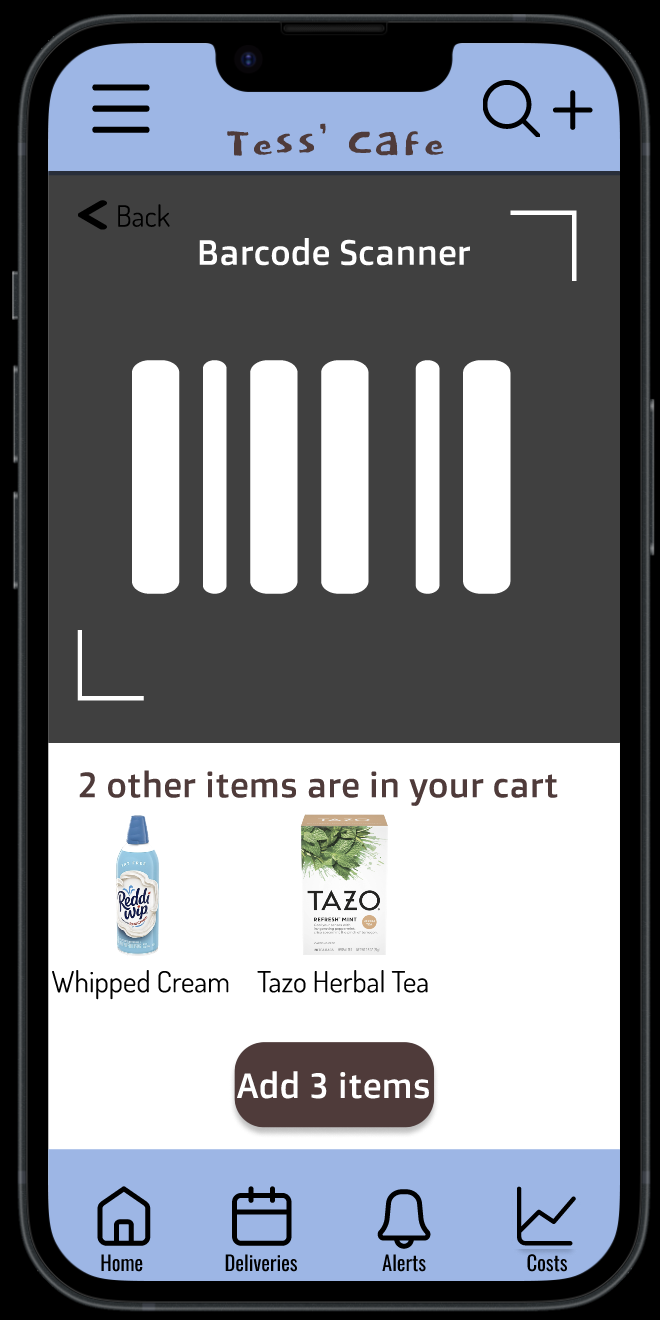
High-fidelity Prototype
This final high-fidelity prototype presented cleaner user flows for viewing ingredient details, managing ingredient levels and viewing inventory related costs. It also meets user needs and pain points.
Link to the cafe’s high-fidelity prototype

Accessibility Considerations
Used icons to help make navigation easier
Used detailed imagery of all ingredients to help all users better understand and visualize their inventory
Included language feature in the menu that allows for people of different backgrounds
Takeaways
As this was my first ever design project from start to end, it was an eye opening experience. I learned that empathizing with users is at the core of UX design, and is implemented in every step. I loved learning about visual design principles and their application in high-fidelity prototypes.
User quote: “I like how intuitive the app is!”
Next steps
Conduct another round of usability studies to validate whether the pain points users experienced have been effectively addressed
Conduct more user research to determine any new areas of need
Refine high-fidelity prototype by adding pages for menu items and more complete ingredient list